Showing posts with label 2D Art. Show all posts

Wednesday, October 14, 2020

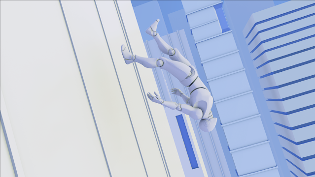
Painting Lab: Inspiration from Mirror's Edge


An Inspiration from Mirror's Edge

 For this week I created a piece inspired heavily from the look of Mirror's edge. To start my project I created a PureRef for my references and payed close attention to how color was used. In Mirror's Edge there is a lot of different shades of blue to show depth while the main character is able to pop against the blue with her hints of red. 

Inspiration and Reference

Once I decided on the look of my piece I knew I wanted the Character to be the main focus.  I grabbed the mannequin's controller and put a parent and scale constraint on it to easily move and scale the rig.  I then brought in some reference and began to manipulate the character's joints into the position I wanted them to be in to give the falling feel. 

Posing the Unreal Engine Mannequin 

From here I then began to create my background with simple primitives and using extrusion to create some interesting buildings.  Because you would only be seeing a the one angle I created a small scene that is dedicated to only being in that one angle versus creating an entire city. 

Building the City Background

Once I got my city set up I created my render camera.  The trick to getting the angle was to have the dual panel layout because you can see that your render camera is looking at in one and then use perspective to manipulate it into place. When I rendered I also rendered 5 different passes so I can set up my passes in Photoshop to create different effects. 

Camera Angle and Bringing in Posed Mannequin 

From here I brought everything into photoshop and used the different passes to create my fog, ambient occlusion and base colors.  I used the same technique demonstrated in the previous assignments to set the stage for this piece. 

Fog, Ambient Occlusion, and Base Colors

I then began to hand paint in details in the midground buildings to give them a little bit of pop.  I also added the sky behind all of the buildings with a color fill layers so that the background buildings can be seen.  

Creating the Background, Giving Depth

From here I began to work on my character.  because the mannequin is mechanic looking I created a design that gives him some more mechanical areas.  I used a dark grey and red to pop him out from the background and left the color fill color as his main color to fil the other areas. For the extra design elements I hand painted them onto the mannequin. 

Working on the Mannequin Character

For the last part I worked on the foreground building.  The foreground building was difficult because I did hand paint over it and finding where the extrusions are became very difficult since they do blend in with where the windows are.  I colored in where I thought the windows were and made each window lighter as they got further away.  On top of creating different shades of blues for each window I also made a ground with the window pieces and made a gradient that went over all the pieces to blend them together. 

Foreground Colors

  To make the window more interesting I created some white lines that show the perspective and give the building a little design.  I also added a second gradient that effects the extruded parts so that they get lighter the further away they are.  Lastly I added a slight reflection of the character in the windows.  Using my ID map I selected the character and gave him a grey fill color.  I then used transform to flip him over the horizontal axis and then distort it a little bit. One I got the placement for the reflection I used the opacity and then used the gaussian blur filter to create it's final look. 

Adding Mannequin Reflection, Gradient, and Perspective


Thursday, October 8, 2020

Perspective Study


Perspective Study

For this project I worked on the concept of perspective.  I was heavily inspired by the idea of the way cities show perspective and used buildings from Chicago for inspiration for my building designs and then letting my own imagination to evolve the look and concept. 

Reference and Inspiration

After looking at some reference, I modeled four different buildings in Maya to create my city with. 

Creating Four Different City Buildings

To make it easier to create my city, I exported my buildings as obj's and saved them in a folder that my content browser accesses. 

Creating a Content Browser Folder for My Buildings

When I was building my city, I payed close attention to variety by scaling and rotating individual buildings.  I then explored one point perspective, two point perspective, and three point perspective. 

One Point Perspective

Two Point Perspective

Three Point Perspective

My favorite was the one point perspective scene and I added the unreal mannequin to add some fun!
From here I rendered an ID, normal, ambient elusion, z depth, and beauty pass to bring into photoshop. 

Beauty Pass of One Point Perspective

From here I brought all my renders into photoshop and used several filters and paint brushes to create my colored scene. 

One Point in Photoshop


Wednesday, September 16, 2020

Value and Contrast


Color and Contrast

This week I learned about value and contrast.  As someone who is still learning Photoshop I was both excited and intimidated about the project.  To start my project I went to look for references and ideas for the look I was going for.  After restarting my project multiple times I had the idea of having colors similar to the colors used on the vehicles from Tron.  From there I thought about other references that has neon colors and then I thought about the colors used in the KDA League of Legends music video and my idea grew from there. 

Reference and Inspiration

To start my project, I had several renders from Maya with the vehicle and the mannequins that all had different data on them such as the line work and normal maps.

Scene with Line Work


I first brought my normal map into Photoshop and then looked at the red, green, and blue channels.  I made a copy of each of these channels and worked heavily on the green channel.  I copied the green channel and created a solid color layer to create color in the environment, vehicle, and mannequins.  Overall I had three of these layers in my file which were the main source of color on the objects. Two of these were to create a color on top and the last one selects the inverse to get the color on the bottom.

 
Photoshop Layers

From here I started to create groups for all of my different renders and groups to hold all of my different colors for individual pieces. 

Creating Groups in Photoshop for my layers

Then I imported my ID render and had it as my top layer.  I would use my magic wand tool and turn down the tolerance to 1 and turn off contiguous.  This allowed me to select individual pieces of the vehicle and mannequins so I could change the color individually.  I did this for pieces such as the wheels and windows on the vehicle.  I did a similar process for the pieces that have some gradient on it.  Instead of having it be a solid color layer there would also be a gradient layer that is above it to create the gradient.  This is an example of a few of my individual colors and gradients.  I also added the Ambient Occlusion layer which had a big effect on all of my colors.

Creating Gradients

Determining the colors for this project was really hard because many of the colors would compete against one another or the color combination did not compliment each other the way I was looking for them to.  A big part of getting the colors compliment one another was getting the background colors to pop out the colors used on the vehicle and mannequins. To start I put a black background and I thought about what needed to be on the outside of the vehicle to make it pop.  I got my idea of paint splatters after looking at some photos of the KDA video and began making my paint splatters.  Right around the edges of the vehicle I used the opacity of 100% but as I got further away I brought the opacity down to 30%.  I chose to use the colors cyan, pink and orange.  I then created fog using the Z depth render and made that into a light cyan color to create my background. 

Adding Fog

My last step was to create some small FX.  I used this to create the small glow on the mannequin's helmet, lights on the vehicle, and beam coming from the satellite.  I created a layer and put it on the color dodge mode.  I then used an airbrush and put that too on the color dodge mode and selected a color.  From here I did some painting in the areas that needed some glow. 

Creating Glow on the Mannequins


Tuesday, September 8, 2020

Ship Silhouettes

 This week I created some silhouettes of nine different spaceships using Maya and Photoshop. 

Ship Silhouettes

I started out in Maya with a spaceship model that was already completed.  To get the scene ready, I used my perspective camera to get a top view of the ship and then duplicated the camera and made small adjustments to the placement.  Once the camera was in place I created a keyframe on the camera in case I accidentally move it.  I then hid the lights in the scene to turn the model black. 
Already Completed Ship


From here the model was ready to be modified!  By duplicating, scaling, using soft select, creating new objects, and extruding, I was able to create new ship designs.

Modified Ship Design

Once I got the design I was looking for, I took a screen shot of the ship and brought it into Photoshop.  I set up my Photoshop file by creating two color filled layers to create the background and the bar at the bottom of the file.  I then created some simple numbering for the different ships and added my name and file name at the bottom.  From here I created a layout for the spaceships and created two groups for the top and bottom rows which are held in a big folder for holding all the designs.

Photoshop Layers

From here I created all my ship designs in Maya and imported them into Photoshop.  I cleaned them up with the magic wand tool to take out the background and scaled them and repeated until I got the final result!

Thursday, September 3, 2020

Basic Shapes

This week I learned about using Maya and Photoshop together to make some concept art focusing on the element of basic shapes.  As an individual who does not have a lot of experience painting and drawing in Photoshop, I found this exercise to be daunting.  Using Sparth's concept art as a reference and inspiration, I put together my favorite spaceships and environments. 

Reference and Inspiration

After collecting my reference I then began the modeling process in Maya.  I created this spaceship from piecing together parts from other spaceship and my own design ideas.  My process for creating my ship was to make all the pieces separately so I can really look at the shapes and then piece it together.   

Building the Ship Wings

Building Ship Body

Once I created my spaceship I took a screen shot in Maya and brought it over to Photoshop. My next step was to create a color pallet and painting in the colors.  I learned about the importance of layers and the different types of layers used for mixing and shading colors.

Drawing and Coloring Ship

After doing some clean up and creating a background, I fully learned about the process used for creating concept art using both Maya and Photoshop.

Clean Up and Background

Zenko Rig Reel

Zenko Rig Reel Zenko was my capstone character that I rigged and animated for Zenko: A Fox's Tale.  He is built to have a very reactive ...